case study
Hargreave & Flynn luxury commerce experience case file.
Hargreave & Flynn needed a premium commerce experience that translated a boutique sleep brand into product discovery, comparison, checkout confidence, and mobile refinement.
← all case files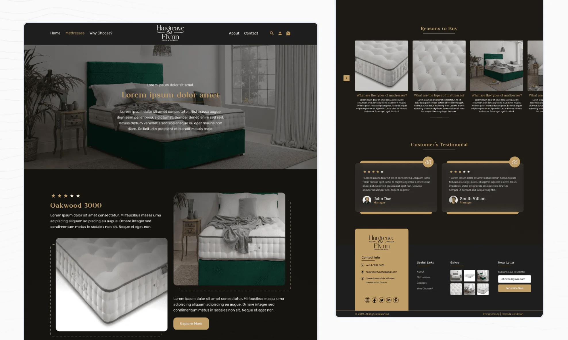
the build
What the build actually covered.
workflow decisions
-
Treated product discovery as a guided buying conversation.
-
Kept the checkout calm, scannable, and trust-focused.
-
Preserved brand quality across mobile and desktop instead of treating mobile as a compressed version.
engineering scope
-
Shopify experience design.
-
Product discovery and comparison flows.
-
Checkout trust patterns.
-
Responsive commerce design.
related services
-
UX and product design
-
Product engineering
stack and patterns
-
Shopify UX
-
Commerce design
-
Product storytelling
-
Responsive interface design
product evidence
How premium commerce felt more consultative online.
The Shopify experience translated a boutique sleep brand into guided discovery, refined product storytelling, and a calmer path from product interest to checkout confidence.
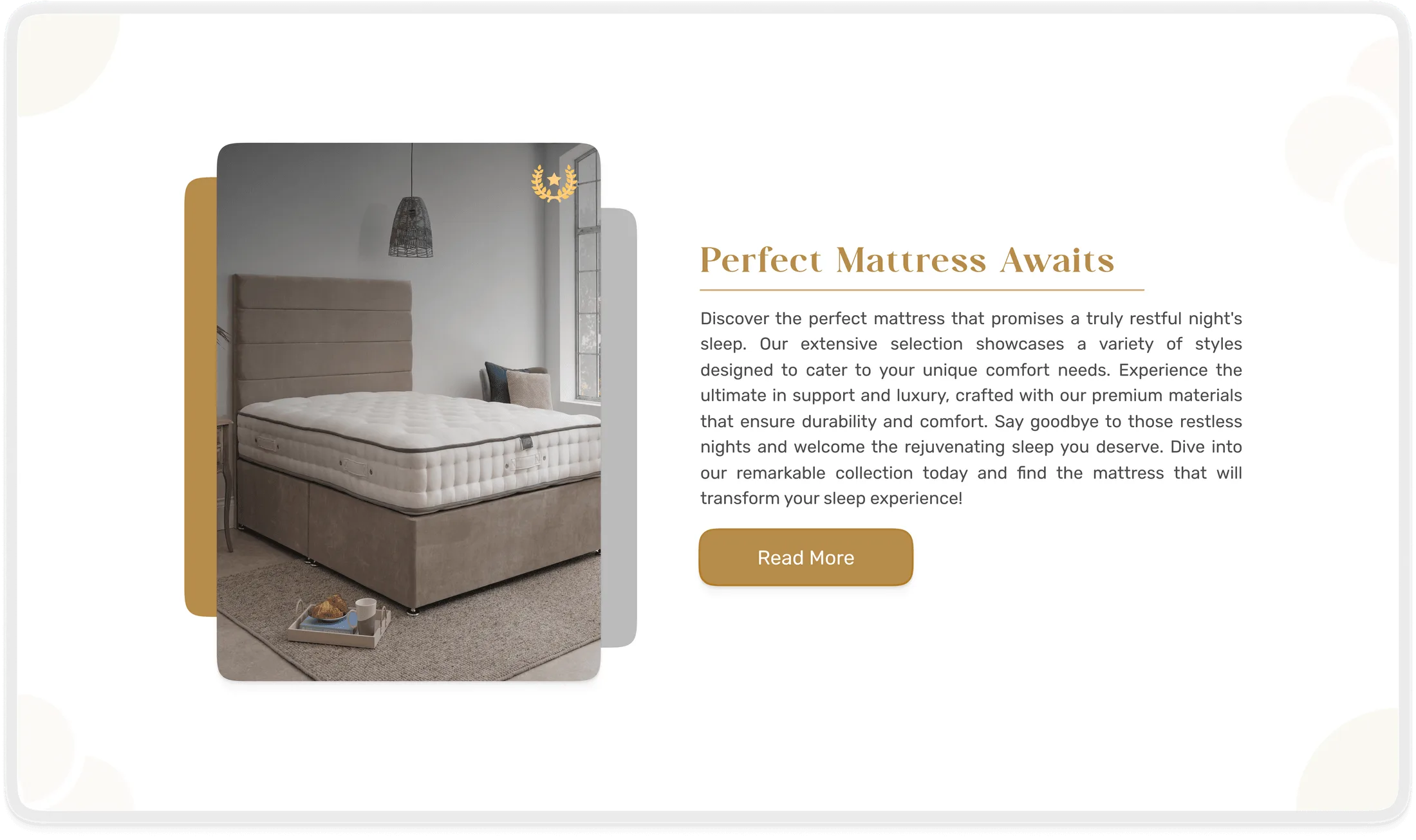
Refined visual system.
Warm palettes, elegant typography, and breathing room frame the product instead of crowding it with promotional noise.
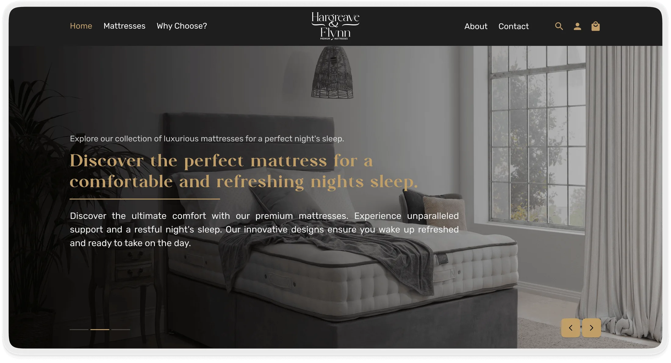
Intelligent product discovery.
Conversational filters and comparison tools guide buyers toward fit without dumping them into spec sheets.
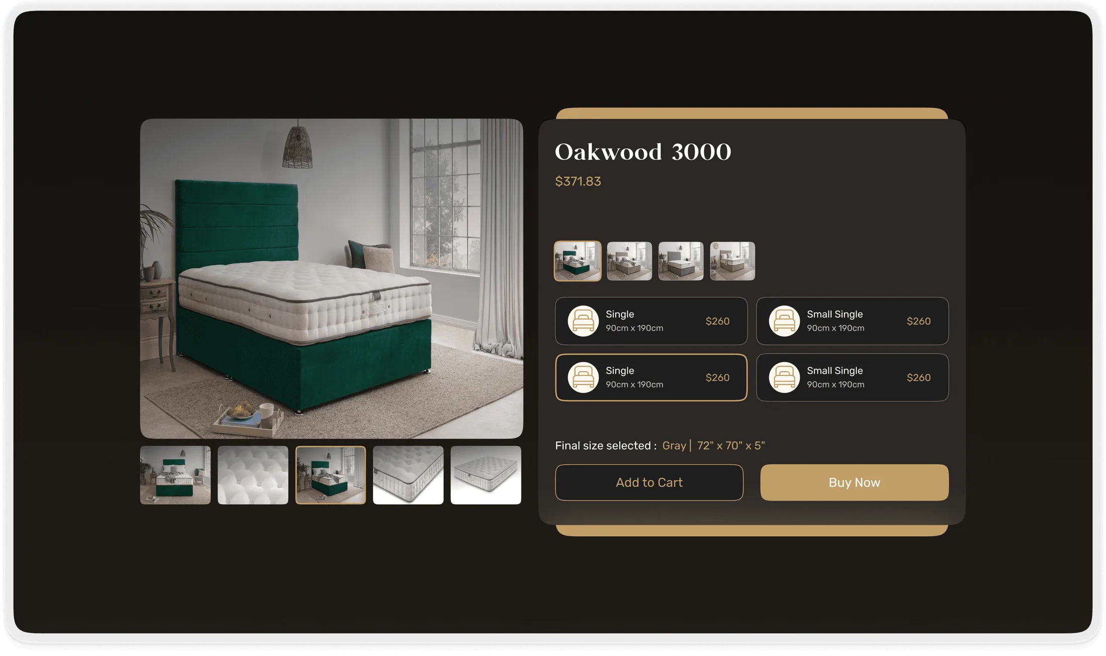
Trust-building checkout.
Subtle trust markers and a calm summary keep the luxury experience intact through the final click.
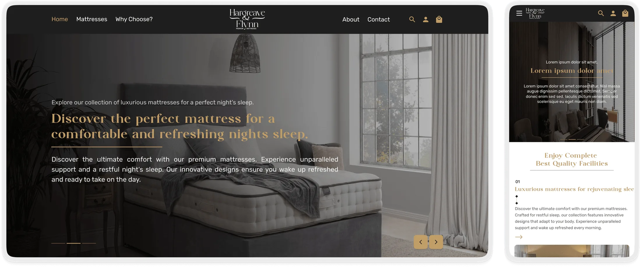
Responsive luxury design.
Brand quality holds across desktop and mobile instead of compressing into a thinner version of itself.